Integrating Shadcn Components into StartupBolt
Shadcn comes preconfigured with StartupBolt, allowing you to quickly add and use UI components in your project. This guide will show you how to add components and configure dependencies using the Shadcn CLI.
Important Update
This documentation is under development and will be updated regularly. If you have any questions, please contact me by email at startupbolt@gmail.com or on Twitter at https://x.com/nifal_adam (opens in a new tab). I will immediately help you.
Adding Components
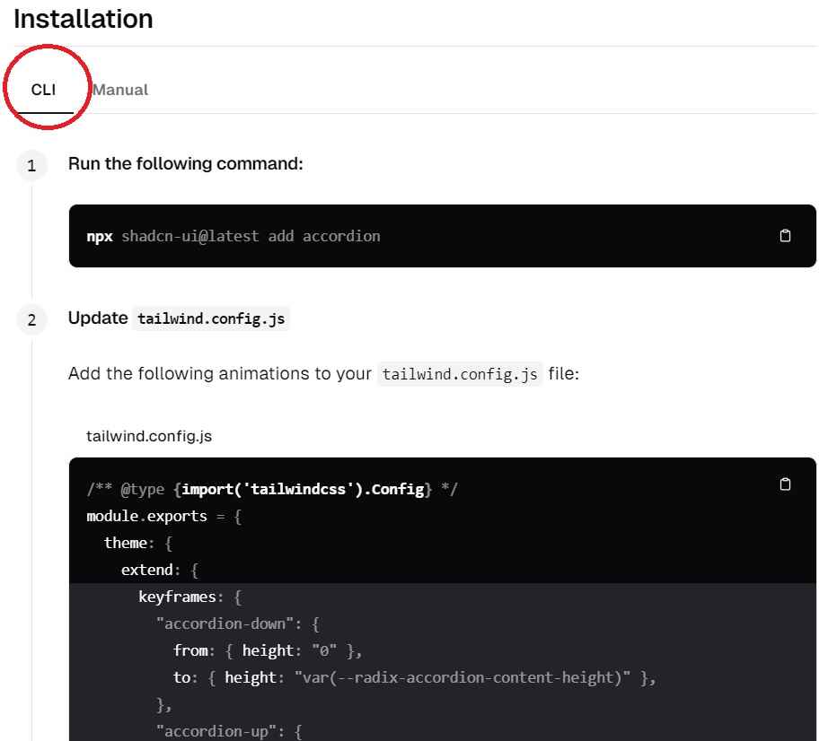
To add a component to your project, visit the Shadcn documentation for the specific component. For example, to add the Accordion component, follow these steps:
-
Go to the Accordion documentation (opens in a new tab).
-
Navigate to the "Installation with CLI" section.
-
Run the following command in your terminal:
npx shadcn-ui@latest add accordion -
Follow any remaining instructions to complete the module creation.
Important: By default, all Shadcn UI components are added to the /modules/shadcn/ui/ folder in your StartupBolt project. Additionally, the corresponding dependencies are automatically included in your package.json. Since Shadcn uses @radix-ui components, you will see @radix-ui dependencies included in your package.json.
Configuration
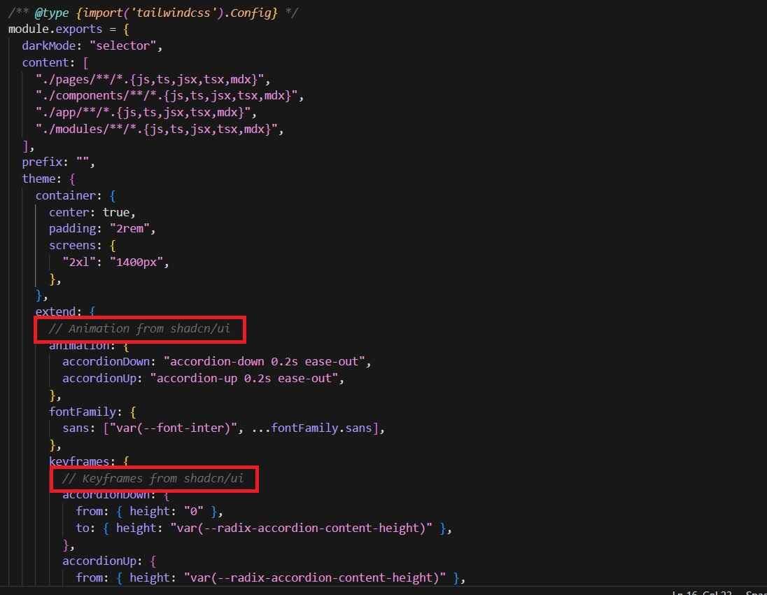
Some components require updates to your tailwind.config.js file located in the root directory. For the Accordion component, add the following configuration:
/** @type {import('tailwindcss').Config} */
module.exports = {
  theme: {
    extend: {
      keyframes: {
        "accordion-down": {
          from: { height: "0" },
          to: { height: "var(--radix-accordion-content-height)" },
        },
        "accordion-up": {
          from: { height: "var(--radix-accordion-content-height)" },
          to: { height: "0" },
        },
      },
      animation: {
        "accordion-down": "accordion-down 0.2s ease-out",
        "accordion-up": "accordion-up 0.2s ease-out",
      },
    },
  },
}
Usually, you can add the tailwind.config.js changes under the sections marked with comments // Animation from shadcn/ui and // Keyframes from shadcn/ui.
Usage
To use the Accordion component in your project, import the necessary parts from Shadcn and implement them in your code.
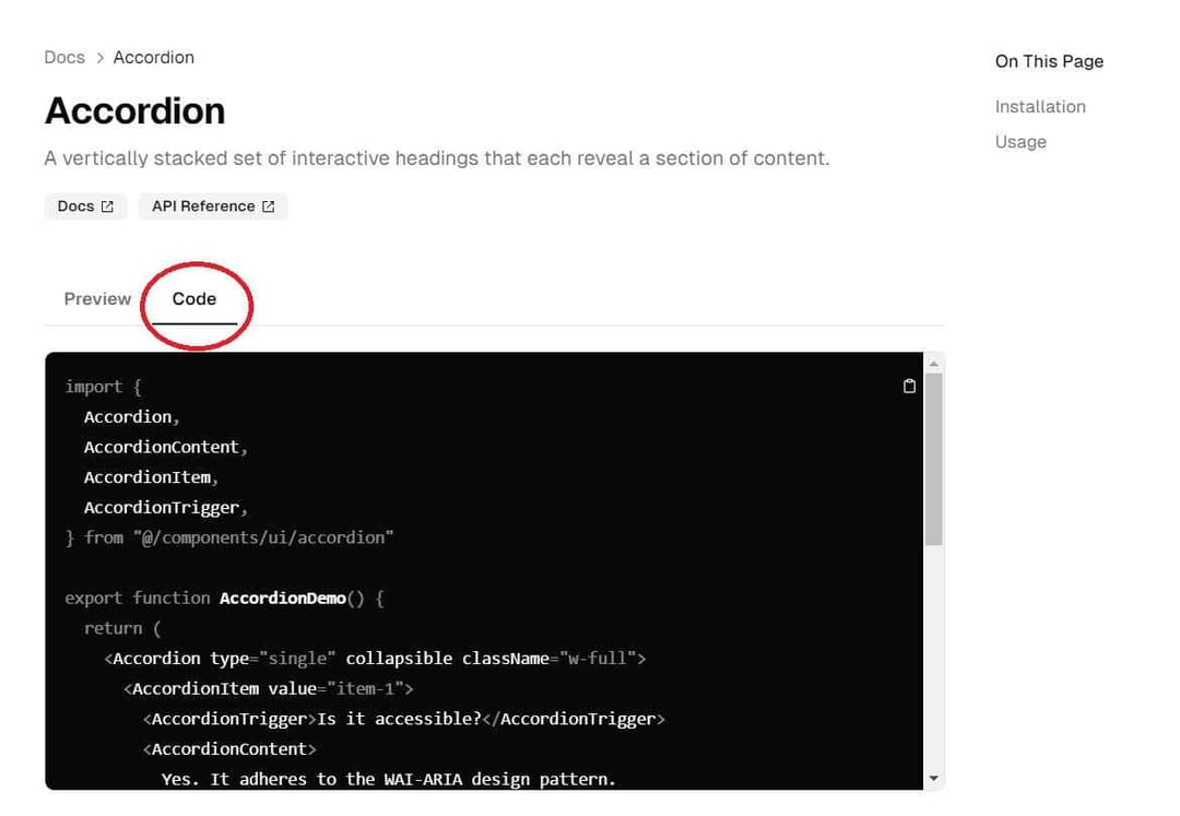
Change the import path from @/components/ui/accordion to the correct folder in the StartupBolt project, which is @/modules/shadcn/ui/accordion.
For example:
import {
  Accordion,
  AccordionContent,
  AccordionItem,
  AccordionTrigger,
} from "@/modules/shadcn/ui/accordion"

const MyAccordion = () => (
  <Accordion>
    <AccordionItem>
      <AccordionTrigger>Section 1</AccordionTrigger>
      <AccordionContent>Content for section 1</AccordionContent>
    </AccordionItem>
    <AccordionItem>
      <AccordionTrigger>Section 2</AccordionTrigger>
      <AccordionContent>Content for section 2</AccordionContent>
    </AccordionItem>
    {/* Add more AccordionItem components as needed */}
  </Accordion>
);

export default MyAccordion;
Important: When creating new components using Shadcn UI components, save them in the /modules/shadcn folder. This folder is designated for your custom components that utilize Shadcn UI.
For example, save the new component in an appropriately named file like MyAccordion.js within the /modules/shadcn folder.
You can use the above component in your application as follows:
import MyAccordion from "@/modules/shadcn/MyAccordion";

export default function Page() {
  return (
    <div className="flex flex-col max-w-4xl mx-auto">
      <MyAccordion />
    </div>
  );
}
Note: The /modules/shadcn folder in your StartupBolt project already contains several useful components. These can be used directly in your project. Feel free to create new components to suit your needs.
Feel free to use Tailwind CSS to improve the style of MyAccordion.js or any other Shadcn component. You can also compose new components by combining Shadcn components with your custom elements to create more complex UI structures.
This example demonstrates how to import and use the Accordion component in your project. You can customize and expand upon this example as needed.
components.json
The components.json file is a configuration file for Shadcn, located at the root of your project in /components.json. It is pre-configured and requires no further adjustments.
For more detailed information, refer to the official documentation: Shadcn Components JSON (opens in a new tab).
{
  "$schema": "https://ui.shadcn.com/schema.json",
  "style": "new-york",
  "rsc": true,
  "tsx": false,
  "tailwind": {
    "config": "tailwind.config.js",
    "css": "app/globals.css",
    "baseColor": "slate",
    "cssVariables": true,
    "prefix": ""
  },
  "aliases": {
    "components": "@/modules/shadcn/components",
    "utils": "@/utils/shadcn",
    "ui": "@/modules/shadcn/ui",
    "lib": "@/utils/shadcn/lib",
    "hooks": "@/utils/shadcn/hooks"
  }
}
This file defines various settings such as styling, Tailwind CSS integration, and path aliases, ensuring your Shadcn components are properly configured for your project.
Conclusion
Integrating Shadcn components into your StartupBolt project is straightforward and quick. By following the steps outlined above, you can enhance your project with beautiful and functional UI components.
Remember:
- Shadcn UI components are added to
@/modules/shadcn/ui/by default. - Create your new components using Shadcn UI in the
/modules/shadcnfolder. - Several useful Shadcn components are available in the
/modules/shadcnfolder for your reference and use.
For more components and detailed documentation, visit the Shadcn documentation (opens in a new tab).